Posted in politics, Topical Statistics

First post-election analysis

The aftermath of the General Election has led to much discussion about the reliability of the pre-election polls.

One thing that is yet unknown is the potential influence the opinion polls themselves had on how people voted in relatively close contests. Were potential UKIP voters more likely to stick with Conservative candidates in constituencies that could turn Labour? How much did the “fear of SNP” holding the balance of power affect previous Liberal Democrat voters in England? Who stayed away from polls: could this have dramatically have influenced the weightings that should have been given in pre-election polling?

Having sourced results data from the BBC website [by constituency, based on AP reporting of results] and also electorate sizes from the AP website I decided to look at aspects of election voting that have not (as yet) been widely discussed. There are still some minor issues with the data – where the turnout (as reported by the BBC) is not the same as that based on AP figures for the electorate size (9 constituencies in total).

I have decided to put the mapping data to one side at the moment – lots of maps (of both winners and runners-up) abound at the moment, and detailed spatial analysis will wait until I confirm the data about electorate sizes.

TurnoutByRegion

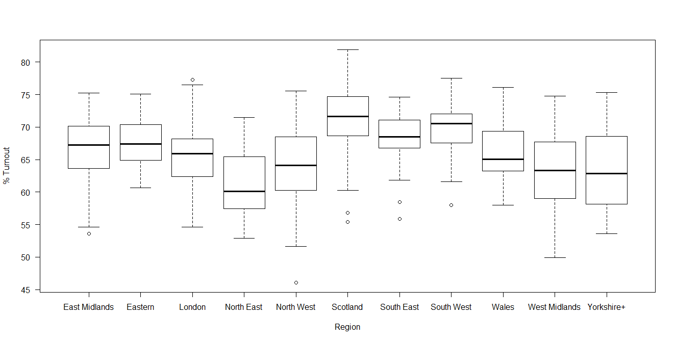
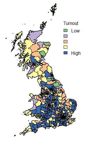
Turnout in Scotland did indicate that in the post-referendum climate, increased voter engagement and participation has continued. Compare the graph above with that of 2010 and the difference in Scottish engagement is evident.

TurnoutByRegion2010

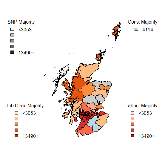
Now looking at the margins of victory – by region and by victor.

TurnoutMarginRegionWinner

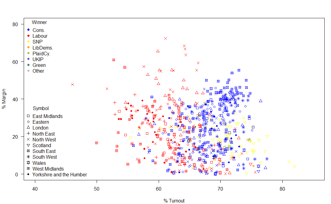
So, what is striking about this image? Some Labour MPs had a huge margin of victory. Really a margin of victory of greater than 20% of voters is inefficient distribution of votes. Otherwise, the main talking points are the high turnout in many Scottish constituencies and the fact that the SNPs didn’t have the complete landslide of votes that their return of seats (almost 95% of Scottish seats) suggested and also that there was a much higher turnout in Conservative seats than in Labour seats.

Of the 2,909,882 valid votes cast in Scotland, the SNP polled 1,454,439 (49.98%), with Labour on 24.06%; 15.16% for the Conservatives and 7.55% for the Liberal Democrats. However, due to the First Past the Post system, the return on votes for the SNP resulted in them winning all but 3 of the 59 Scottish seats.

In Wales: Conservatives 27.25% [11 out of 40 (27.5%) seats]; Labour 36.86% [25 (62.5%) of seats]; UKIP 13.63% [0 seats]; Liberal Democrats 6.52% [1 seat]; Plaid Cymru 12.12% [3 (7.5%) of seats].

Wales is therefore a prime example of how UKIP failed spectacularly in converting votes into seats.

Before the election, there was speculation about how the UKIP vote would affect the main parties. UKIP did poll relatively well in “safe” Conservative seats – building their vote share with no direct return.   The effect on the Labour vote was more direct – UKIP polled slightly better in areas that could have been marginal Labour victories [in the 15000-20000 Labour votes; the Conservatives won 61 seats, Labour won 91 seats, the Liberal Democrats 1 seat and the SNP won 18 seats] than they did in the equivalent Conservative seats. Therefore, UKIP voters had more of an influence in potential Labour gains over Conservatives than was perhaps expected.

ConsVUKIP

LabourVUKIP

Other than the unfortunate problem of lack of proportionality created by FPTP voting, another issue is caused by the discrepancy in the sizes of the electorate. Welsh constituencies, in particular, are unusually small and may be subject to boundary changes in the future: the very small Scottish constituencies are islands which don’t lend themselves to easy mergers with parts of the mainland.

ElectorateByRegion

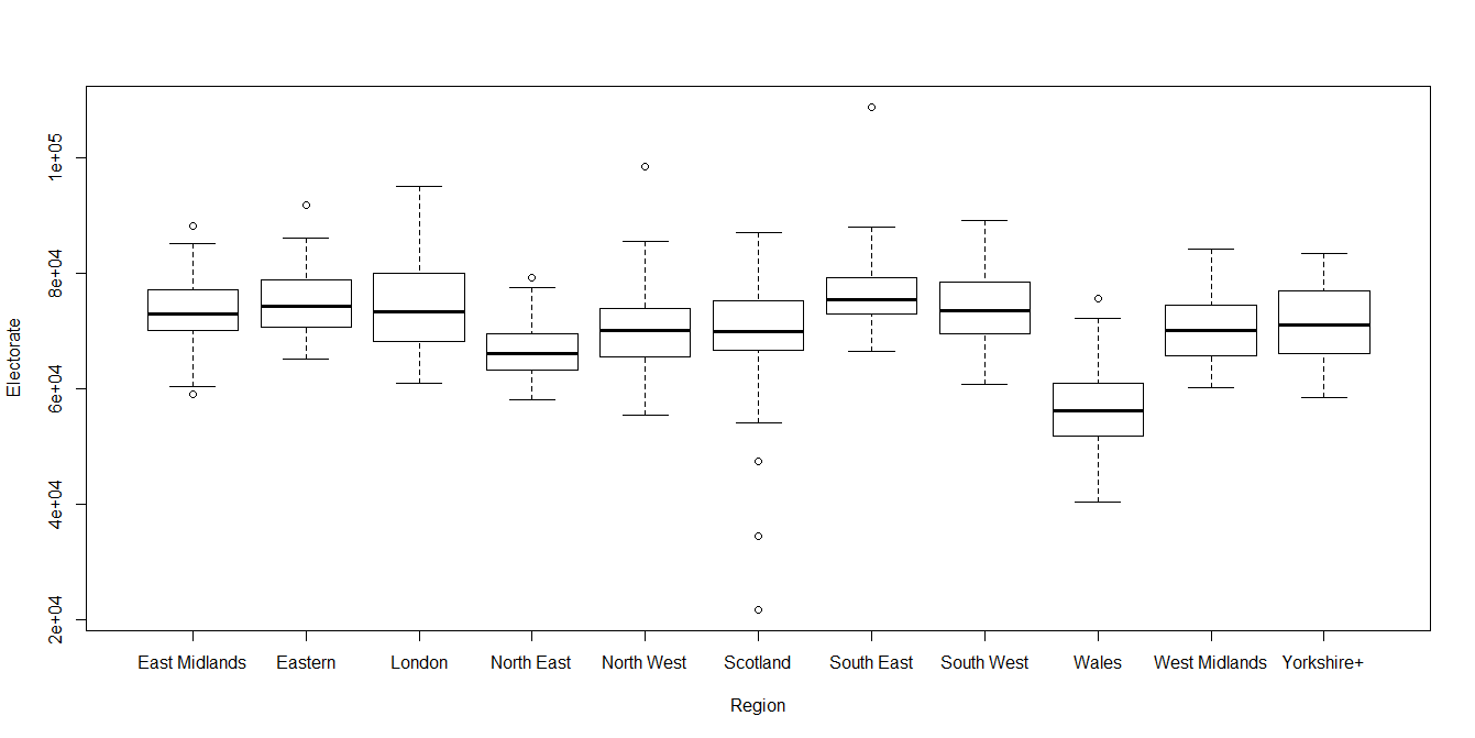
All discussions about changing the electoral system should first consider fixing the current system: the size of the constituencies is too variable to be considered equitable.

Thus the size of the margin matters in terms of the number of potential (not just actual) voters.

PercentMarginElectorate

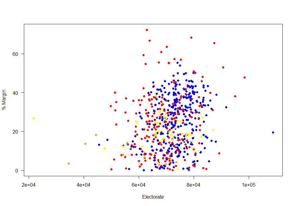
So who had “important” votes?   Those in the bottom left of this graph: relatively small electorates in close contests. The two extremes (left and right) of this graph represent island constituencies [Na h-Eileanan an Iar is the smallest constituency, while the Isle of Wight is the largest constituency].

Looking at the constituencies where the margin of victory was less than 5% of those who voted by the size of the constituencies. Four out of the Liberal Democrats eight seats were on margins of less than 5% of valid votes. Turnout in these close seats were (on average) higher than in the seats with a closer margin: so a close race does help to encourage turnout. A “safe seat” is not a helpful thing for voter engagement.

TurnoutElectorateTight

2015
Cons. Green La

bour

LibDems. PlaidCy. SNP UKIP Speaker
2010 Cons. 295 0 10 0 0 0 1 0
Green 0 1 0 0 0 0 0 0
Labour 9 0 209 0 0 40 0 0
LibDems. 27 0 12 8 0 10 0 0
PlaidCy. 0 0 0 0 3 0 0 0
SNP 0 0 0 0 0 6 0 0
UKIP 0 0 0 0 0 0 0 0
Speaker 0 0 0 0 0 0 0 1

The main unexpected outcome of the election was not the collapse of the Liberal Democrat vote but the extent to which Liberal Democrat seats were won by Conservative rather than Labour votes. However, this should not have been surprising, as 38 of the Liberal Democrats had a Conservative runner up in 2010. But only 17 Liberal Democrat seats had a Labour runner up in 2010.

Runner Up 2010
Winner 2010 Cons. Labour LibDems. PlaidCy. SNP Other
Cons. 0 137 167 0 0 2
Green 0 1 0 0 0 0
Labour 147 0 76 5 28 2
LibDems. 38 17 0 1 1 0
PlaidCy. 1 2 0 0 0 0
SNP 4 2 0 0 0 0
Speaker 0 0 0 0 0 1

Only 109 out of 632 GB seats changed parties this election. These swing seats were mainly Liberal Democrat to Conservative (27) and Labour to SNP (40). Conservatives retained 295 of their 306 2010 seats; gaining 36 from Liberal Democrats and Labour. Labour retained only 209 of their 258 2010 seats; the SNP gained 50 seats from Labour and the Lib Dems. The SNP gains were particularly noticeable as they had come second in 29 constituencies in 2010 (having won 6). In 21 of their seats that they won this time round, the SNP came from at best a third place in 2010.

So – what have we learned from all of this. The election results were far messier than many had anticipated. There is a lot of analysis to be done and all of the soul-searching about the appropriateness and efficacy of opinion polls will no doubt be of interest to many statisticians. As no preferences are expressed under the FPTP system we will never really know the extent of tactical voting in UK elections.
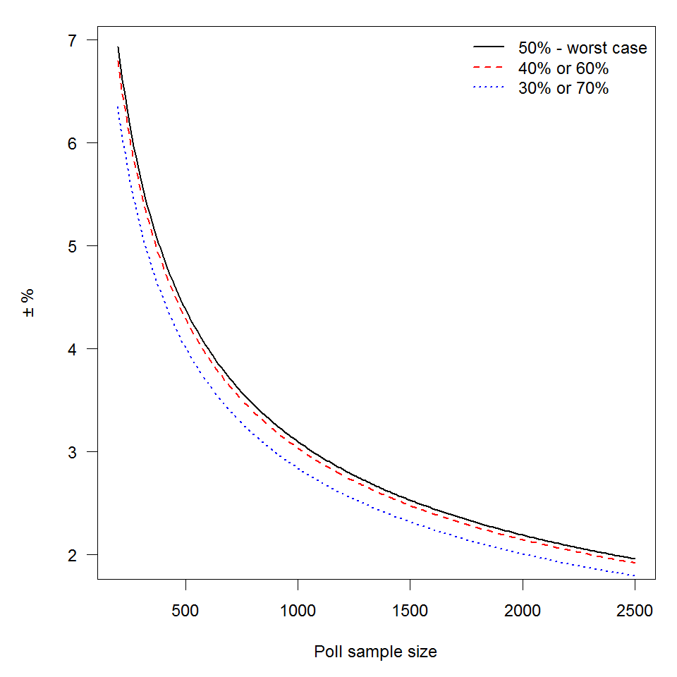
Posted in Uncategorized

The aftermath

So, given the results of the election, a few things are up for discussion:

  • Polls got it wrong – why?
  • There seems to be an interesting relationship between turnout in each constituency and which party won.
  • Lib Dem collapsed into Tories
  • UKIP failed at the voter concentration problem required for FPTP system.

I’m currently typing in all the data from the GB constituencies, as I haven’t been able to find it in a decently machine readable format as of yet – I don’t have access to the Press Association feeds to get a clear version.  Of all the above, at this stage, it looks as if the turnout will be most (personally) interesting; also it hasn’t really been discussed in the same length as the other points.

There goes my weekend.

Posted in politics

Final (Election) Countdown

A quick peak at how marginal the different seats were in the 2010 election.

Election majority (2010 general election)

To interpret this map: the darker the colour, the greater the majority.  I’ve looked at the 3 major (2010 general election) parties in this map.  Still working on a better colour scheme for screens; if current polls are correct, I’ll need another colour for the Scottish National Party, and at the moment it is difficult to distinguish between some of the reds [Labour] and oranges [Liberal Democrats].

Considering that Labour won 258 seats in 2010, some may find the relative lack of red on the map surprising.  This illustrates one of the problems of mapping constituencies that are really different sizes due to population density disparities.  Therefore, looking at the NUTS1 regions allows more detailed map to be used.

London, Scotland and the SouthWest are used as illustrating examples of looking at things at NUTS1 level.

London Majority in 2010

London demonstrates some obvious spatial patterns – inner and outer London didn’t vote in the same way in 2010 – will this change this year? If so, will demographic changes have influenced any changes? Or would socio-economic factors be a bigger driver of change in voting behaviour?

South West Majorities (2010)

So, a major difference between London and the South West is the lack of Labour seats… but also the lack of dark shades – there are many more “closer” seats in the South West than in London – the colours on this map will definitely change on Friday!  Also, the odd shaped constituency near the top of the map is Bristol North West – some of the boundary is in the Bristol Channel – due to the strange shape of Avonmouth!

Scotland majorities (2010)

The Tories only won a single seat in Scotland… so really there was no need to show an actual scale for them.  The SNP are expected to dramatically change this map too!

So, work to do before Friday: better colour scheme – I’ll have to go away from colours that are related to the traditional colours.

Also, I need to sort out the socio-demographics (based on Census data) for the constituencies and ecomonic factors – which will be limited by the data that is available on a constituency level [for example JSA claimant count records the number of people claiming Jobseekers Allowance (JSA) and National Insurance credits, which is not an official measure of unemployment, but is the only indicative statistic
available for areas smaller than Local Authorities.]

I’m not sure how much use the readily available data will be when it comes to explaining the regional variations (especially the differences between 2010), but it will be a busy weekend of analysis.

London JSA rates (March 2015, not seasonally adjusted)

A note: the constituency with the highest JSA [and those claiming National Insurance credits] claimant rate is Birmingham Ladywood  – with an estimated rate of 14.6% of economically active residents.  The next highest is also in Birmingham (Hodge Hill) with the JSA* rate estimated at 9.7%

Posted in Uncategorized

Election Preparation

In anticipation of some interesting results, I’ve been accumulating data on a constituency basis to be ready to do some analysis of the results of the UK general election on the 7th May.   I’m also playing with the current maps – how best to cope with shifting electoral boundaries.

I’ve deliberately avoided commenting on the polls here – as I would prefer that this remain as apolitical as possible. My thoughts on current polls are they are generally too broad – not capturing the local tactical voting that happens with first past the post systems. Lord Ashcroft’s polls have been interesting as they have been done on a constituency basis; the great unknown is how much these polls may influence tactical voting within marginal seats.

The data has been tidied up sufficiently to produce turnout maps from the previous general election – the purpose of this was really to set up all the matching rules for how different organisations name constituencies.  It’s a surprising amount of faff – why couldn’t everyone work with the ONS codes (or at least include them in the datasets for easy matching!)?

GBturnout

I’ve also worked out the niceties of “zooming in” for dense areas that are difficult to see on a national map with London used as an example.

LondonTurnout

So I think that I’m ready to go for analysis of the election results next week! Results should be interesting.

Posted in Uncategorized

Gone quiet… reasons and excuses

So I’ve been rather lax with my posting schedule recently.  A combination of three things conspired against me writing anything sensible here.

  1. I’ve been contributing towards another piece for Significance – reviewing the methodologies of different polling companies in Great Britain (as most don’t bother with Northern Ireland) in advance of the General Election.
  2. Teaching – my final year class in applied statistical modelling had a major piece of coursework (modelling the number of arrivals per hour at a festival and using that information to inform the organisers about optimal arrangments for opening hours etc) meant that I was providing a lot of additional time to my students.  I enjoy this part of my teaching as it really allows for students to develop beyond the scope of what can be taught in large groups, but it is extremely time consuming.
  3. Computer issues. I’ve had some pretty major computer issues recently; affecting both my personal laptop and my work machine.  Both had to be replaced (my work machine did give me the lovely warning of “imminent hard drive failure” just in time.  These caused numerous delays over the last month, so something had to give in my efforts to catch up.

Hopefully things will start to run a bit more smoothly (regression towards the mean would imply that this should be a reasonable assumption!) and I will be able to devote a bit more time to writing about the interesting things stats related that are sure to be popping up with a bit more frequency in the run-up to the election.

Posted in politics

Politicians and the (mis)use of statistics

“We need to reward politicians who give us better data and we need to persecute those who dare to use slight-of-hand and mislead us.”

In his piece on Newsnight on Wednesday night (4th February) Ben Goldacre discussed the need for evidence-based decision marking, especially in the political arena – and how democracy needs evidence, not just principles and ideas. This raised a number of interesting concepts that may not have been fully considered at this stage: including the punishment of politicians who misuse statistics and encouraging politicians to create better evidence of what works and what fails.

“Without good quality evidence we are all flying in the dark”

One idea mooted to create better evidence of what works and what fails is to perform randomised trials of policies.

When introducing any new policies, we could randomly split people into two groups – one group for whom the new policy would apply, the other group would remain with the status quo. There would need to be clear measures of success in place before the changes were made. This would be a definite improvement on the state how policy changes are evaluated.

However, with any trials involving people, we, as researchers, need to get ethical approval. Who would provide ethical approval for this? People participating in studies also need to give informed consent and have the ability to withdraw from a study. In terms of implementing unpopular policy changes this would make finding people to willingly participate in these randomised studies of policy efficacy would be extremely difficult.  Should we be willing to bend the standard ethical framework for research in order to measure the efficacy of policies?

In 2013 Iain Duncan Smith (the Secretary of State for Work and Pension) wrongly claimed that official government statistics showed that the coalitions’ benefits cap had got 8000 extra people back into work – briefing journalists secretly before the official data publications. The UK Statistics Authority pointed out exactly how this claim was incorrect “in luxurious detail” (Andrew Dilnot’s official letter to Iain Duncan Smith is here) – that being the extent of the reprimand.

So, how should we appropriately reprimand politicians and others in power how misuse statistics? As opposed to the vicious punishment proposed by Ben Goldacre, I would counter that perhaps additional lessons in the use of statistics would be more appropriate. My, slightly ad-hoc punishment and re-education scheme would be something along these lines:

  • 1st Offence: A two hour seminar (or equivalent) with an online test afterwards
  • 2nd Offence: A full day course (or equivalent in the number of hours) with an online test with the results of the test published online.
  • 3rd Offence: The equivalent of a level one course in statistics (not one aimed at UG mathematics or statistics) with a subsequent essay on why they were wrong (in each of the previous offences) that is published online for public comment which would be graded (pass or fail) by statisticians from the UK statistics authority.
  • 4th (and subsequent) Offence(s): Fines – they’ve had their chances; these fines would go towards the funding of the courses for the previous three offences.

These punishment / rehabilitation schemes for misusers of statistics would, of course, be open to refinement and updating as needs be. People would be referred into the scheme for re-education (although some people may consider it to be a punishment) by the UK statistics authority. Those referred into the system would need to repeat attendance at courses until they pass the tests.

Posted in Uncategorized

Ranking educational institutions

Why rankings of institutions are not a great idea…

It is that time of the year again – when we hear about the rankings given to schools in the UK (which was discussed on Radio 4 Today’s programme this morning). While much time was given to the fact that they have “moved the goalposts” by changing the criteria on which the rankings are assessed, not much time was given to the old chestnut that the idea of ranking schools is just not a good idea as the ranks are too unstable to be meaningful.

Another ranking that is topical (in Higher Education circles at least) is those that will arise from the National Student Survey; BSc Mathematics in general have quite high satisfaction scores and relatively small class sizes, so relative rankings can change quite dramatically year on year with only random variation from the true underlying “satisfaction rating” of a degree programme.

I decided to simplify the problem and to simulate it to illustrate the major problem.

I took 16 different percentages (or the associated probabilities of success / satisfaction) – from 80 – 95%. For each of these values I modelled 5 sets of data, each representing 15 years of data, with the potential sample sizes (number of respondents) varying at random between 45 and 55. I then modelled the number of successful (or satisfied) students and hence the proportions – which depend on the corresponding sample sizes. These proportions were then turned into annual ranks – so in each of the 15 “years” an institution would have been ranked between 1 and 80 (with, for clarity, the lower ranks indicating better performance).

The graph illustrates the problem. The black dots indicate the median rank across the 15 “years” of data. The red dot represents the “true” ranking – located in the centre of each of the groups of institutions with tied true rankings. The grey dashed lines in the background show the span of values of the rankings given year-on-year.  Many of these dashed lines span almost the entire range of possible rankings!

Variation in Rankings

Moral of the story is, when comparing many institutions with very similar performances, ranks are meaningless in practice. If anything needs to be compared, compare the raw values (%) so that people can see how little difference there exists in practice – as you can see below, by treating each institution in isolation, the random variations over time become still exists but people can judge for themselves as to whether any observed difference is large enough to cause real concern (a jump of 3 percentage points may have a dramatic difference in the ranking position when everyone is tightly bunched together).

Treating each institution in isolation

I chose the range 45-55 as it is a common range of the number of responses in the National Student Survey for BSc Mathematics degrees.  Looking at Bristol data for Key Stage 2, and the 29 schools with a minimum of 85% achieving level 4 or above in reading, writing and maths at KS2, the numbers of eligible students in each of these schools range from 20 to 91, with a median of 45 students [so the same range is sensible].

Posted in Uncategorized

Margins of error in opinion polls

Hmmm: what’s the fuss about an opinion poll?

The Guardian published an article with the headline “Labour lead falls as Greens hit 20-year high in Guardian/ICM poll”; but can this headline really be supported by the evidence they supply?

According to the footnote at the bottom of the piece: ICM interviewed a random sample of 1,002 adults aged 18+ by telephone on 16–19 January 2015. Interviews were conducted across the country and the results have been weighted to the profile of all adults. ICM is a member of the British Polling Council and abides by its rules.

Why do many national opinion polls use about 1,000 respondents?

The margin of error for support of a party – or how close we expect our sample to be to the true value (which we don’t know), depends on the percentage of people (p) expressing support for a party and the sample size (n) used.  More precisely, we use a 95% Confidence Interval (so if we were able to calculate this interval many times, 95% of the time the true level of support would be within these intervals – but in any given interval, we aren’t certain if the true (but unknown) value is actually contained in the interval).

It is: \pm 1.96\times \sqrt{\frac{p(100-p)}{n}}

The closer the value of p is to 50%, then the higher this value will be for any given n. The worst case scenario (in terms of the widest margin of error) occurs at 50%, so let’s examine that case:

\pm 1.96\times \sqrt{\frac{50(100-50)}{n}} = \pm 1.96\times \sqrt{\frac{50\times 50}{n}} = \pm 1.96\times 50\times \sqrt{\frac{1}{n}} = \pm 98 \sqrt{\frac{1}{n}}

The 40% case (which has the same results as the 60% case) is

\pm 1.96\times \sqrt{\frac{40(100-40)}{n}} = \pm 1.96\times \sqrt{\frac{40\times 60}{n}} = \pm 39.2 \sqrt{\frac{6}{n}}

The 30% case (which has the same results as the 70% case) is

\pm 1.96\times \sqrt{\frac{30(100-30)}{n}} = \pm 1.96\times \sqrt{\frac{30\times 70}{n}} = \pm 19.6 \sqrt{\frac{21}{n}}

pollSampleSize

The graph illustrates this quite neatly – the margin of error at a sample size of 500 is \pm4.0, at 1000 it is \pm2.8, while at 1500 it is \pm2.3. Once you get a sample of about 1000, any additional gain in terms of reducing your margin of error is hard won.

So, how does all this actually reflect on the current party standings?

The current poll reports the following:

  • Labour Party: 33% no change
  • Conservative Party: 30% +2
  • Liberal Democrats: 11% -3
  • United Kingdom Independence Party (UKIP) 11% -3
  • Green Party 9% +4
  • Other 7% +1

Using the formula introduced above, the 95% confidence intervals for percentage support for each party was calculated and included on the graph below (as dashed lines).

ICM_GuardianPoll_withErrorsIf ICM have managed to randomly sample from the voting population and appropriately weight the results to match the profile of all adults then the current state of affairs can be viewed as a snapshot of the support at the moment (with some wiggle room as illustrated by the graph above). However, that’s the biggest if of the lot!! Hopefully, I’ll be returning to that issue in the run up to the election in May.

Posted in Uncategorized

Aftermath of travelling – redesigning airport security screening areas

December was spent travelling, which meant going through airport security. Bristol airport used to be a breeze – no queues at security, but over the last year, this has drastically changed. This time round, queues were the worst that I’ve experienced; to the point that I paid to go through the express queue. Dublin airport, on the other hand, was a breeze. For many years I passed through the chaos of Dublin airport at peak time [which is about 5am]; the queues were long but they moved fast, so although my last trip may not have experienced it at its worst, there did appear to be something different. Dublin airport reported almost 22 million passengers in 2014 [Dublin airport website]  whereas Bristol airport has reported just under 6 million passengers for the first 11 months of the year [Bristol airport website]. Dublin airport has two security areas (one in each terminal) and about three quarters of a million transiting passengers. Taking this into consideration, at least one of the two security screening areas in Dublin sees more passengers than Bristol (if not both).

The two very different experiences of this led me to think about the design of the security areas. Being the curious sort, I looked up the recommended layout for security areas – and found the US TSA (Transport Security Agency) recommendations [TSA airport security design guidelines]. Interestingly there was much discussion about along room for people to repack their items after passing through the security checkpoint, but only passing reference to the space before the checkpoint. To me, this seemed to be the major difference between Bristol and Dublin airport. Dublin airport has generous space prior to the security conveyor belt so that passengers can prepare their bags whilst still in the queue, Bristol airport has limited space, so that only the first two passengers in the queue can unload the relevant items from their bags with ease.

Being a statistician, I thought about whether anyone has formally done any experiments on optimal design of the security screening area for improved throughput of passengers. Within a constrained space, is it better to allow more space before or after the metal detector?

Ideally, we would create a formal setup that could be varied so that we could have a number of different layouts within the same airport; but this is not the most practical.  Therefore a more pragmatic route would be to look at countries with many airports with the same security specifications that have a variety of designs. Then we could compare the passenger throughout at peak times at the different airports [taking, of course, information such as the number of lanes open; if there are dedicated “slow movers” (wheelchairs and buggies) lanes and number of security personnel per lane into account].

If this design layout was then adopted, then it would make a life less stressful. It also makes me wonder if anything has used a scientific experimental approach when design interior layouts?

Posted in Uncategorized

Statistical Ambassador training at the Royal Statistical Society

Last Tuesday I spent the day in the Royal Statistical Society HQ in London with 10 other statisticians training to be statistical ambassadors. For the day we were joined by Scott Keir (from the RSS), Prof David Spiegelhalter (Winton Professor of the Public Understanding of Risk, University of Cambridge), Timandra Harkness (journalist and comedian) and by Prof Kevin McConway (Open University) for the morning.

The morning started with the typical ice-breaker activity of finding things in common with one another – there was a definite circus theme to many of my connections; I’m not sure what this says about the group! This was followed by getting down to the serious business of thinking about how to communicate statistical concepts to a wider audience – everything from multiple testing; screening tests to margin of error and p-values. We moved onto composing a short description of ourselves and our work – we could pick the format of a short paragraph, a tweet or twitter biography or ten key words. The shared feedback on this was really useful in thinking about the problem.

Lunch and photographs were next on the main agenda. I still haven’t seen the resulting photographs so I can’t really comment on how these turned out! After lunch, Timandra really kicked off with some of the stranger and funnier challenges such as communicating statistical concepts (or relatively well-known statistical stories) through charades and sound effects. We then progressed to thinking about stage presence and non-verbal means of communication. Our last major activity was to pair up and create a scene from a movie based on a statistical concept. Timandra assigned a variety of genres to use; we were assigned “dystopian science fiction” – which resulted in me ending it with “an Irish mammy guilt stare” [direct quote from another trainee ambassador!] however it was the explanation of multiple testing in the style of a musical that had us all in fits of laughter. Other genres included James Bond, romantic comedy and horror (vampire). The training element of the day ended with a nice example using giant playing cards lead by David.