Posted in Uncategorized

Margins of error in opinion polls

Hmmm: what’s the fuss about an opinion poll?

The Guardian published an article with the headline “Labour lead falls as Greens hit 20-year high in Guardian/ICM poll”; but can this headline really be supported by the evidence they supply?

According to the footnote at the bottom of the piece: ICM interviewed a random sample of 1,002 adults aged 18+ by telephone on 16–19 January 2015. Interviews were conducted across the country and the results have been weighted to the profile of all adults. ICM is a member of the British Polling Council and abides by its rules.

Why do many national opinion polls use about 1,000 respondents?

The margin of error for support of a party – or how close we expect our sample to be to the true value (which we don’t know), depends on the percentage of people (p) expressing support for a party and the sample size (n) used.  More precisely, we use a 95% Confidence Interval (so if we were able to calculate this interval many times, 95% of the time the true level of support would be within these intervals – but in any given interval, we aren’t certain if the true (but unknown) value is actually contained in the interval).

It is: \pm 1.96\times \sqrt{\frac{p(100-p)}{n}}

The closer the value of p is to 50%, then the higher this value will be for any given n. The worst case scenario (in terms of the widest margin of error) occurs at 50%, so let’s examine that case:

\pm 1.96\times \sqrt{\frac{50(100-50)}{n}} = \pm 1.96\times \sqrt{\frac{50\times 50}{n}} = \pm 1.96\times 50\times \sqrt{\frac{1}{n}} = \pm 98 \sqrt{\frac{1}{n}}

The 40% case (which has the same results as the 60% case) is

\pm 1.96\times \sqrt{\frac{40(100-40)}{n}} = \pm 1.96\times \sqrt{\frac{40\times 60}{n}} = \pm 39.2 \sqrt{\frac{6}{n}}

The 30% case (which has the same results as the 70% case) is

\pm 1.96\times \sqrt{\frac{30(100-30)}{n}} = \pm 1.96\times \sqrt{\frac{30\times 70}{n}} = \pm 19.6 \sqrt{\frac{21}{n}}

pollSampleSize

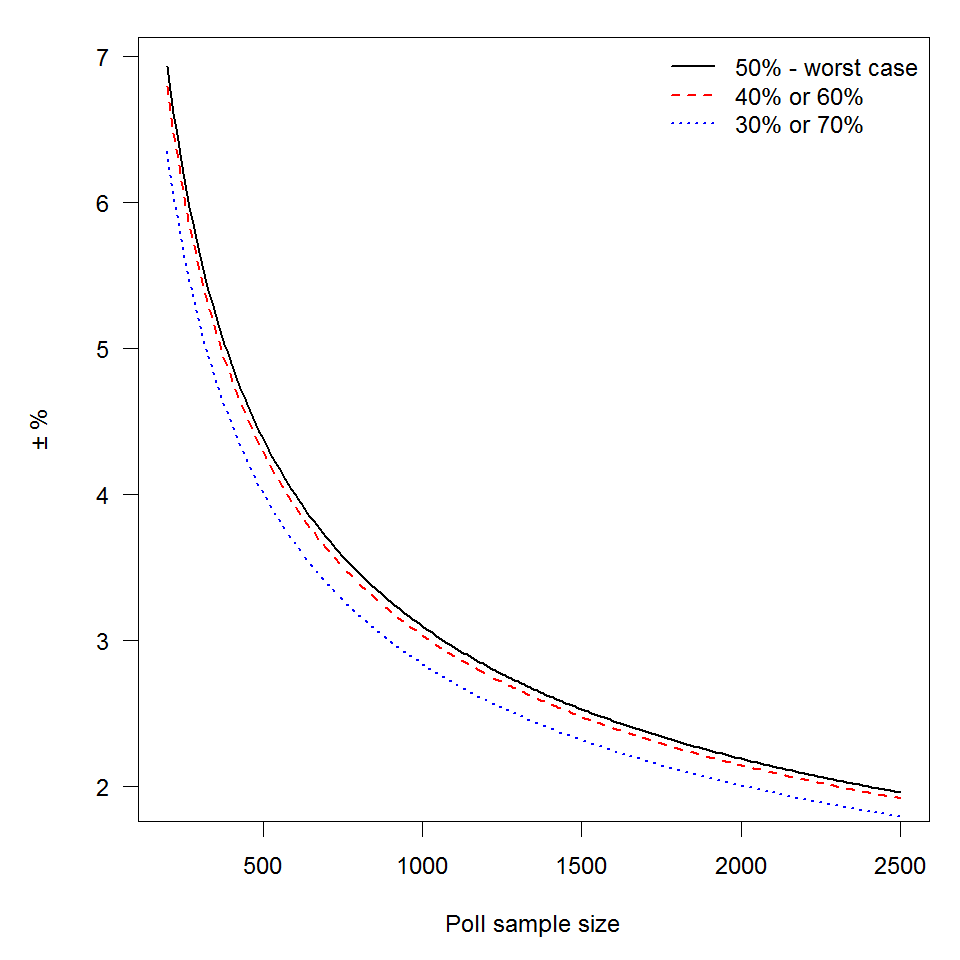
The graph illustrates this quite neatly – the margin of error at a sample size of 500 is \pm4.0, at 1000 it is \pm2.8, while at 1500 it is \pm2.3. Once you get a sample of about 1000, any additional gain in terms of reducing your margin of error is hard won.

So, how does all this actually reflect on the current party standings?

The current poll reports the following:

  • Labour Party: 33% no change
  • Conservative Party: 30% +2
  • Liberal Democrats: 11% -3
  • United Kingdom Independence Party (UKIP) 11% -3
  • Green Party 9% +4
  • Other 7% +1

Using the formula introduced above, the 95% confidence intervals for percentage support for each party was calculated and included on the graph below (as dashed lines).

ICM_GuardianPoll_withErrorsIf ICM have managed to randomly sample from the voting population and appropriately weight the results to match the profile of all adults then the current state of affairs can be viewed as a snapshot of the support at the moment (with some wiggle room as illustrated by the graph above). However, that’s the biggest if of the lot!! Hopefully, I’ll be returning to that issue in the run up to the election in May.

Posted in Uncategorized

Aftermath of travelling – redesigning airport security screening areas

December was spent travelling, which meant going through airport security. Bristol airport used to be a breeze – no queues at security, but over the last year, this has drastically changed. This time round, queues were the worst that I’ve experienced; to the point that I paid to go through the express queue. Dublin airport, on the other hand, was a breeze. For many years I passed through the chaos of Dublin airport at peak time [which is about 5am]; the queues were long but they moved fast, so although my last trip may not have experienced it at its worst, there did appear to be something different. Dublin airport reported almost 22 million passengers in 2014 [Dublin airport website]  whereas Bristol airport has reported just under 6 million passengers for the first 11 months of the year [Bristol airport website]. Dublin airport has two security areas (one in each terminal) and about three quarters of a million transiting passengers. Taking this into consideration, at least one of the two security screening areas in Dublin sees more passengers than Bristol (if not both).

The two very different experiences of this led me to think about the design of the security areas. Being the curious sort, I looked up the recommended layout for security areas – and found the US TSA (Transport Security Agency) recommendations [TSA airport security design guidelines]. Interestingly there was much discussion about along room for people to repack their items after passing through the security checkpoint, but only passing reference to the space before the checkpoint. To me, this seemed to be the major difference between Bristol and Dublin airport. Dublin airport has generous space prior to the security conveyor belt so that passengers can prepare their bags whilst still in the queue, Bristol airport has limited space, so that only the first two passengers in the queue can unload the relevant items from their bags with ease.

Being a statistician, I thought about whether anyone has formally done any experiments on optimal design of the security screening area for improved throughput of passengers. Within a constrained space, is it better to allow more space before or after the metal detector?

Ideally, we would create a formal setup that could be varied so that we could have a number of different layouts within the same airport; but this is not the most practical.  Therefore a more pragmatic route would be to look at countries with many airports with the same security specifications that have a variety of designs. Then we could compare the passenger throughout at peak times at the different airports [taking, of course, information such as the number of lanes open; if there are dedicated “slow movers” (wheelchairs and buggies) lanes and number of security personnel per lane into account].

If this design layout was then adopted, then it would make a life less stressful. It also makes me wonder if anything has used a scientific experimental approach when design interior layouts?

Posted in Uncategorized

Statistical Ambassador training at the Royal Statistical Society

Last Tuesday I spent the day in the Royal Statistical Society HQ in London with 10 other statisticians training to be statistical ambassadors. For the day we were joined by Scott Keir (from the RSS), Prof David Spiegelhalter (Winton Professor of the Public Understanding of Risk, University of Cambridge), Timandra Harkness (journalist and comedian) and by Prof Kevin McConway (Open University) for the morning.

The morning started with the typical ice-breaker activity of finding things in common with one another – there was a definite circus theme to many of my connections; I’m not sure what this says about the group! This was followed by getting down to the serious business of thinking about how to communicate statistical concepts to a wider audience – everything from multiple testing; screening tests to margin of error and p-values. We moved onto composing a short description of ourselves and our work – we could pick the format of a short paragraph, a tweet or twitter biography or ten key words. The shared feedback on this was really useful in thinking about the problem.

Lunch and photographs were next on the main agenda. I still haven’t seen the resulting photographs so I can’t really comment on how these turned out! After lunch, Timandra really kicked off with some of the stranger and funnier challenges such as communicating statistical concepts (or relatively well-known statistical stories) through charades and sound effects. We then progressed to thinking about stage presence and non-verbal means of communication. Our last major activity was to pair up and create a scene from a movie based on a statistical concept. Timandra assigned a variety of genres to use; we were assigned “dystopian science fiction” – which resulted in me ending it with “an Irish mammy guilt stare” [direct quote from another trainee ambassador!] however it was the explanation of multiple testing in the style of a musical that had us all in fits of laughter. Other genres included James Bond, romantic comedy and horror (vampire). The training element of the day ended with a nice example using giant playing cards lead by David.

Posted in Uncategorized

Best laid plans …

Last Friday I gave another session of Statistics for Journalists; the Department for Business, Innovation and Skills funded scheme coordinated by the Royal Statistical Society, this time in London City University.  It didn’t exactly run to plan.

We were expecting to have only an hour with a bunch of MA students to try to explain the basics of statistics.  This, in reality by they time they are settled in, would have been more like 45 minutes.  I ran this session with two other statisticians (London based).

We were most rudely interrupted by a fire alarm that meant that we didn’t have an opportunity for a proper Q and A session nor did we quite get through all of the planned material – today’s “Statistics for Journalists” course went quite well.  We were allowed to run slightly over, but still lost about 10 minutes due to the disruption, so had under 40 minutes with the students.

Disappointingly, we didn’t get to cover relative risk – but we did leave the slides with their lecturer so that hopefully the more interested students will use them for some targeted learning.

What would I have changed? Honestly, at this point, not much – although it’s the second time I’ve seen the “traffic camera” exercise being run and students have not really engaged with it. I think that I would need to have a rethink about how to present this is exercise if I lead it. It definitely needs more time that has been given to it in previous sessions.

On a more positive note, the feedback from students is good – with them more aware of some of the common pitfalls that they need to be aware of in their professional careers. They also now know the difference between a percentage and a percentage point! They have also stated that they will be more sceptical about statistics in the future…

Posted in Uncategorized

RSS Statistical Ambassador Scheme

It’s been officially announced that I’m one of the twelve Royal Statistical Society’s statistical ambassadors

http://www.statslife.org.uk/members-area/member-news/news-from-errol-street/1876-rss-selects-twelve-statistical-ambassadors-for-training-programme

I couldn’t contain my enthusiasm previously, so did let people know before this – however, my natural tendency towards being nosey has been satisfied now that I see who else is on the list.

My training starts in November, so some blog posts about the process and my experiences are sure to follow.

Posted in Uncategorized

Open but not readily usable data

As part of their final year projects, I get my students to source their own datasets.  I have several reasons for this, but the main one is that you don’t really appreciate how messy data can be until you try to put together a suitable dataset yourself…

Over the last few years it has become easier to source many different types of data, although the Office for National Statistics website search is still a mess.  However, every year I still find data in embedded within publically available documents but not in a very usable form.

One of my pet peeves is data being made available in the form of pdfs rather than in a more useful format that can be easily imported into statistical packages. A current example of this is data about the Ebola outbreak being made available in pdfs.  However, some people [such as @cmrivers] with better scripting ability than I do have managed to turn it into something more useful and have popped it onto github.

Whatever about issues surrounding making data available in the first place, if data is to be made public, make it available in a useful format!