Posted in politics, Uncategorized

Trump’s tweets (and the Women’s March comparison)

So, I’ve been working on sentiment analysis again.  What could be more topical than analysing the tweets from the period after Trump was elected to before he was sworn in.

I downloaded Trump’s tweets from twitter in R (from the handle @realDonaldTrump)

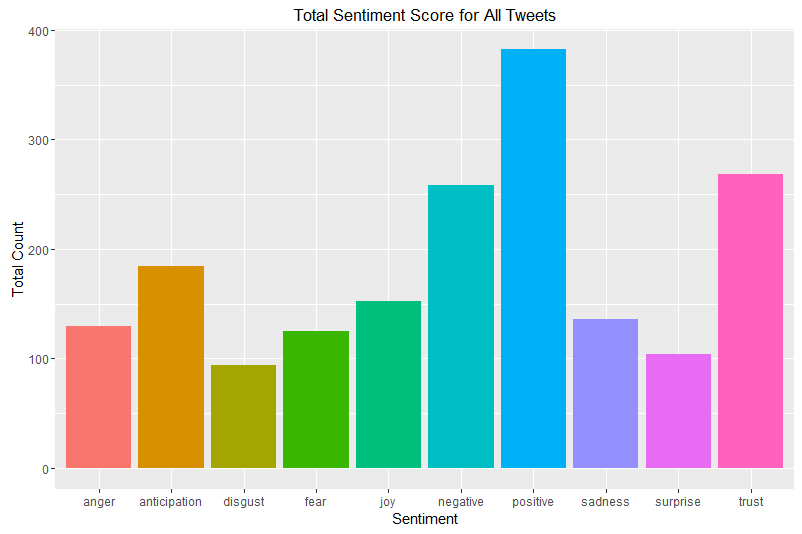
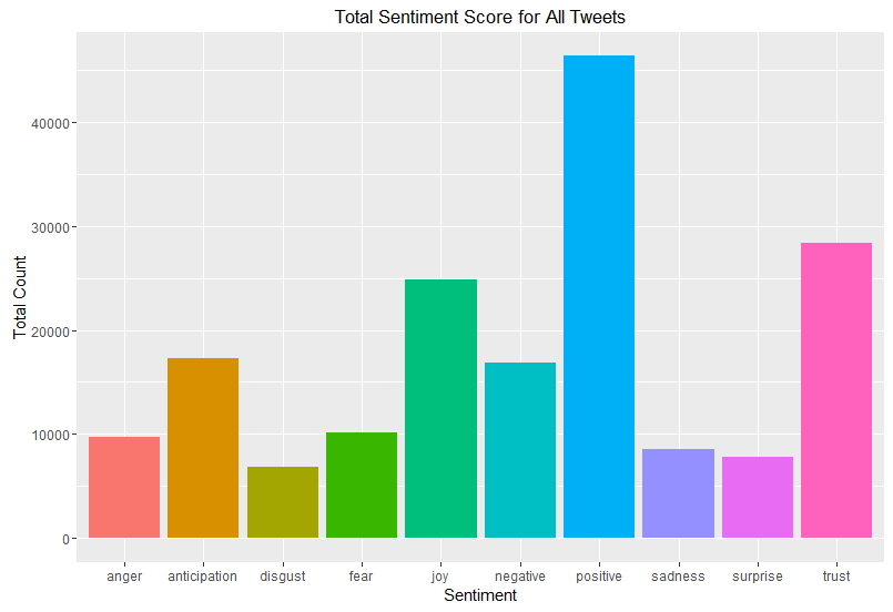
Using the syuzhet package in R it is very simple to perform sentiment analysis; with some simple manipulation afterwards, we can see the profile of the different “Sentiment Score”.  A step-by-step guide is here.

First look at the profile across all of the tweets:

trumps tweets sentiment counts

But, things with Trump are not quite that simple.  It has been previously speculated that Trump’s tweets from Android devices are not written by the same person as Trump’s tweets from other sources. The general conclusion is that the tweets from Android are written by Trump himself, but tweets from other devices are written by staffers. The time of posting the tweets can be investigated to see if there are patterns:

time of Trumps tweets as President Elect

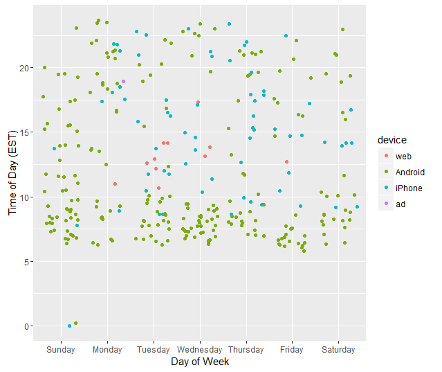
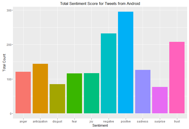
It becomes very obvious that whoever is tweeting from the iPhone is primarily active during office hours – with a few evening [18] tweets that were either thank you tweets or mentioning events that evening or the following morning. So, let’s look at those tweets written on an Android:

Number of tweets sent via an Android device with each particular sentiment

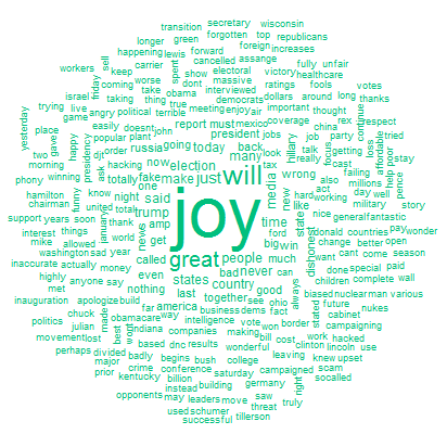
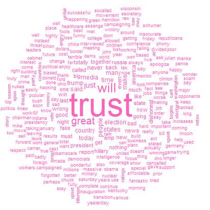
In the following sequence of wordclouds, the word in the middle corresponds to the sentiment in the graph above.

So what words were said in tweets that the sentiment analysis deemed to be angry?

wordcloud of angry Trump tweets as President Elect

Compare this to the joyful tweets:

wordcloud of joyful Trump tweets as President Elect

and the tweets expressing “trust”

wordcloud of trusting Trump tweets as President Elect

This process is continued for the other sentiments…

Who might be interested in this type of analysis?  It doesn’t just apply to political figures; companies may be interested in the sentiments being expressed about their brands / services and in particular may be interested about the effects that changes have on what is being said online.  Whether you are aware about it or not, this type of analysis is happening every day and is providing insight into how people think about a wide variety of terms.

There are limitations, of course.  These include the problem of sarcasm and emojis. Automatic sentiment analysis struggles to capture sarcasm.  Furthermore, emojis can be converted into text, but the additional meanings behind the emojis (think aubergine) are lost in this process!

Who knows what the future will bring as Donald J Trump has control over both the @POTUS and @realDonaldTrump accounts!

As a quick aside; here’s the sentiment captured between 21:57:57 and 22:40:31 UTC [about 5pm EST and 2pm PST] on Saturday January 21st under the hashtag #WomensMarch. This consisted of approximately 65 thousand tweets in total.  I could have collected more data, but twitter has a limit of 5000 tweets in a single download, so it’s quite a faff to collect more.  Furthermore, I didn’t think that more tweets from earlier in the day to substantially change the pattern.

The names of the “sentiments” are fixed, sometimes not exactly to my preferred choice; tweets with a high “trust” sentiment are often quite hopeful for example… but that is a whole different problem (and is someone else’s problem to worry about!)

womensmarchsentiment

Definitely a more striking ratio of positive to negative tweets.

And the most commonly used words:

WomensMarchWords.png

Finally, for those interested in this tweet:

DJTrumpOnProtest.png

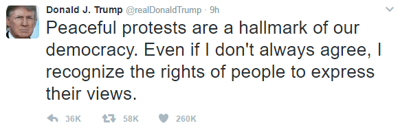
It came from an Android phone on a Sunday (but not very early in the morning / late at night); so those speculating that it was not the man himself tweeting don’t have the obvious indication of it coming from an iPhone!

Posted in Brexit, politics

A lucky immigrant? Immediate post Brexit thoughts

I’m a lucky immigrant. I’m skilled and my skills are transferable from one country to another.  However, the atmosphere in England towards immigrants has noticeably (for me) changed during the very long EU referendum campaign.  The focus on controlling immigration has made me feel uncomfortable in my immigrant status for the first time since I moved to the UK in 2009.  As an Irish citizen I had a vote in this referendum and I used it, to no avail.  I also, according to the majority of Leave campaigners, will not have any changes made to my right to live and work in the UK.

Furthermore, during the campaign Michael Gove actively promoted rejecting expert opinion.  This anti-intellectualism is dangerous.  Leave campaigners are now saying that we shouldn’t trigger Article 50 immediately and that “during the campaign we all said things…”.  The consequences were known and they were highlighted by many, yet voters in England and Wales voted in sufficient numbers to override the decisions made by the majorities of the electorate in Scotland and Northern Ireland.   I’m tempted to invoke a claim that all those areas who voted against the EU should be among the first to lose EU income so that they can see just how much more pro-active the EU is on allocating resources to regions.  For too long, the UK government and press has used the EU as a lazy scapegoat rather than taking responsibility for their actions. However, if this rule were to be invoked, then people and worthwhile activities would be affected by unforeseen consequences, much like David Cameron not expecting to have a majority government and thus not being able to blame the lack of a referendum on a junior coalition partner.  The reality of what many people are only waking up to is a bigger shock to the UK market than the 2008 financial crisis or the 1992 ERM crisis and it is no outside entities fault.

Sitting MPs knowingly repeating lies despite the errors being pointed out should be treated as bring the house into disrepute.  For the first time since moving to the UK, I started looking for jobs outside the UK system when the results became obvious overnight.  Today, and especially last night, has not been a good one for me.

Posted in politics, Uncategorized

Transfer Politics

One of the unusual features of the Irish electoral system is that of transferable voting.  Since the constituencies (other than in by-elections or in Presidential elections) have more than one seat to be filled, the bigger parties often run more than one candidate.

They often try to spread the candidates out geographically throughout the constituency, in order to try to capture geographic transfers as well as party transfers.

Using an example,  from a 3-seat constituencies: Cork North West, I will explain how the transfer system works.  The calculation for the quota (the point at which a candidate is elected) is as follows:

\frac{NVotes}{NSeats+1}+1=\frac{NVotes}{4}+1

where NVotes is the number of valid votes, and NSeats is the number of seats being contested. Thus in the case of a three seat constituency, a candidate has to accumulate one vote more than 25% of the number of valid votes to be automatically elected [note that this doesn’t apply at the final count, as some votes are not transferred and so the effective number of votes is reduced].

CorkNorthWest

Count 1: All number 1 preferences are counted for each candidate.

At the end of Count 1, in the case of Cork North West, no candidate was elected, so they decided to eliminate candidates. In this case the three candidates (O’Donnell, Griffin and O’Sullivan) with the fewest 1st preferences were eliminated together.

Why aren’t they eliminated one at a time? Well, consider the case of the four lowest polling candidates:

  1. Green Party: C. Manning 1354
  2. Independent: J. O’Sullivan 478
  3. Independent: S. Griffin grey 439
  4. Communist Party: M. O’Donnell  185

The sum of 2-4 on this list is 1102.  So therefore, if they were to be eliminated one at a time, and all the transfers went to the next highest in the queue – so all O’Donnell’s 185 1st preference votes were transferred (by expressing number 2 preference) to Griffin (to result in a value of 624 votes for Griffin) and then O’Sullivan is eliminated (still having only 478 votes, having received no direct transfers from Griffin) and all O’Sullivan’s votes also go to Griffin, Griffin would still only have 1102 votes, which is less than Manning’s 1354.

Therefore, after Count 1, all of the ballot papers that had 1st preferences for O’Sullivan, Griffin or O’Donnell are then examined and the 2nd preferences are looked at. The votes are then literally transferred into the candidates’ that received the number 2 rank pile of ballot papers.

At the end of Count 2, still no one has reached the quota, so Manning (the remaining candidate with the fewest votes) is eliminated.  Any of Manning’s votes that attempt to make their next preference for one of the already eliminated candidates have their next available preference considered.  Note that, since a Supreme Court judgement, if a voter forgets to include a preference – so gives ranks 1-3, forgets 4, restarts at 5, then all preferences after 3 are deemed invalid and the vote becomes non-transferable.

This process continues until Count 8, when a candidate is elected (if more than one is elected on the same count, the one with the greater surplus is considered first; if the excess is so small as to not to make a difference to potential order of elimination/election, they may choose to go straight to the next elimination).  Counters look at the last pile of votes added into Creed’s pile of votes – the transfers from Collins, another candidate from the same political party.  They look at all the next preferences in this pile and then split the number of excess votes in proportion to the next available preference (after Creed).  In this case, the majority of these went to O’Shea.   The votes they choose to distributed the excess from are randomly sampled [so as they do not consider lower order preferences, this could, potentially effect who are elected] – but it did not matter in this case, as Count 9 was the last count.

In this count, A. Moynihan exceeded the quota and was deemed elected.

M. Moynihan was then elected without them checking A. Moynihan’s excess as M. Moynihan was sufficiently far in excess of the only other remaining candidate (O’Shea) that it would not have made a difference, even in the unlikely event that all of A. Moynihan’s votes went to O’Shea  (although of the same party, the two Moynihans are not related).  Thus M. Moynihan was elected without making the quota, because, by Count 9 there were 3,650 untransferred votes, making it impossible for the final person elected to exceed the quota.

Posted in politics, Uncategorized

On Voting: different systems

It’s Irish election time; causing me to think about the differences between the UK and Irish election systems for general elections.
UK’s First Past the Post system means that most voters are really voting for a party rather than a candidate. There are safe seats where candidates without any attachment to the constituency can be parachuted in and win. For all the attachment to constituency based politics, I’ve heard little from candidates despite living in a relatively unsafe seat.

Ireland’s Proportional Representation via Single Transferable Vote in multi -seat (3, 4 or 5 seats) constituencies means that there are no fundamentally safe seats. In constituencies that a party is popular in often more than one candidate from the same party is on the ballot paper. This lack of safe seats leads to a lot more clientism and localism in Irish TDs (MPs).

Ideally those elected should contribute to the good of the entire country, not just their constituency, but the Irish system doesn’t necessarily encourage that type of behaviour among voters.

 2011 1st Preferences % of 1st Preferences Number of Seats % of Seats
Fine Gael  801,628  36.1  76  45.8
Fianna Fáil  387,358  17.4  20  12.0
Sinn Féin  220,661 9.9 14 8.4
Labour  431,796 19.4 37 22.3
Others  378,916 17.1 19 11.4

Transferring of votes is very important when considering electoral success in Ireland.  Fine Gael (and to a lesser extent Labour) did well – gaining a greater percentage of the seats in the Dáil than would be expected on a purely proportional split of votes.  Indeed, they encouraged transfers of votes between the two parties (once their own list of candidates was exhausted).

Quotas in Irish General elections are as follows:

  • 3 seat constituencies:  (25% (1/4) of the valid votes)+1 vote
  • 4 seat constituencies: (20% (1/5th) of the valid votes)+1 vote
  • 5 seat constituencies: (1/6th of the valid votes)+1 vote

The final seat often does not make the quota due to people not having a full ranking of candidates (so the effective quota reduces).  This makes the last seat the seat most dependent on the success of a candidate at attracting votes from others.  This has been a traditional problem for Sinn Féin – them failing to attract transfers in the same numbers as other parties (this happened in the last Dublin South-West by-election)

Fianna Fáil did particularly poorly in Dublin in the 2011 election – returning just a single seat:

IrishElection07-seats-Dublin
Number of Seats per party in each Dublin Constituency

Comparing that to the relative share of 1st preference votes; we can easily see what a disaster Dublin was in 2011 for Fianna Fail.

IrishElections07-1stpref-Dublin
1st preference vote share: pie charts are proportional in size to the number of valid votes

In the rest of Ireland, this trend was echoed, but not to the same extent:

IrishElection07-seats-country
Number of seats returned in each non-Dublin constituency

Compared to vote share of 1st preferences:

IrishElections07-1stpref-country
1st preference share by constituency

It will be interesting to see how this changes with the results over the weekend.  The fragmentation of votes has been predicted by polls and media, but whether this will continue down to the vital second, third and fourth preferences will only reveal itself over the weekend.

Posted in politics

Good democracy requires some theatre!

The frenzy to report results overnight after UK general election is unsightly. The rush to be first to declare is especially ridiculous – do we not deserve some care to be taken over the counting of our votes rather than people dashing around with boxes? In the rush to return results some of the potential theatre is lost. Those thinking about reinvigorating the UK system without making dramatic legislative changes should relax, the country won’t collapse if it needs to wait an additional 12 hours for a result, especially after a long campaign, but it may engage a wider audience with the electoral process.

A big difference was noticeable when the Irish referenda were counted over the weekend. By counting the results during the daytime, there was an increased sense of openness about the counting process. Just as justice should be seen to be done, so should the democratic process. Counting the results during the daytime means that the results were announced when the nation was awake and waiting for the results rather than having being finalised overnight, when only political anoraks are awake. The electorate did not wake up to the results; rather they observed first the initial estimates from the initial tallying of votes, then the actual results coming in.

The reporting of these tallies is an important part of the theatre surrounding Irish electoral system. It helps to build the tension throughout the day. Furthermore, they enable a comprehensive understanding of the geographic distribution of the notes not available within the rushed UK system.

Tallying, in Ireland, is done by volunteers of various political persuasions who observe the unfolding of votes from the other side of the fence. Each box is identified and the votes are recorded. The parties co-operate to ensure as wide a coverage of the different boxes as possible.

The process of tallying votes means that we get to hear about the surprises such as the box in Finglas West that was reported to be 100% Yes for the Marriage Referendum. From a political point of view, having this insight into voting at a very local level, there is confidence in the statement that the votes were not split along an urban / rural divide.   The results were more complex; cities and large towns voting yes, with strong yes votes also in some very small villages, but no votes in small towns.

Democracy is a form of theatre, let it be lit by the light of day!

Posted in politics, Topical Statistics

First post-election analysis

The aftermath of the General Election has led to much discussion about the reliability of the pre-election polls.

One thing that is yet unknown is the potential influence the opinion polls themselves had on how people voted in relatively close contests. Were potential UKIP voters more likely to stick with Conservative candidates in constituencies that could turn Labour? How much did the “fear of SNP” holding the balance of power affect previous Liberal Democrat voters in England? Who stayed away from polls: could this have dramatically have influenced the weightings that should have been given in pre-election polling?

Having sourced results data from the BBC website [by constituency, based on AP reporting of results] and also electorate sizes from the AP website I decided to look at aspects of election voting that have not (as yet) been widely discussed. There are still some minor issues with the data – where the turnout (as reported by the BBC) is not the same as that based on AP figures for the electorate size (9 constituencies in total).

I have decided to put the mapping data to one side at the moment – lots of maps (of both winners and runners-up) abound at the moment, and detailed spatial analysis will wait until I confirm the data about electorate sizes.

TurnoutByRegion

Turnout in Scotland did indicate that in the post-referendum climate, increased voter engagement and participation has continued. Compare the graph above with that of 2010 and the difference in Scottish engagement is evident.

TurnoutByRegion2010

Now looking at the margins of victory – by region and by victor.

TurnoutMarginRegionWinner

So, what is striking about this image? Some Labour MPs had a huge margin of victory. Really a margin of victory of greater than 20% of voters is inefficient distribution of votes. Otherwise, the main talking points are the high turnout in many Scottish constituencies and the fact that the SNPs didn’t have the complete landslide of votes that their return of seats (almost 95% of Scottish seats) suggested and also that there was a much higher turnout in Conservative seats than in Labour seats.

Of the 2,909,882 valid votes cast in Scotland, the SNP polled 1,454,439 (49.98%), with Labour on 24.06%; 15.16% for the Conservatives and 7.55% for the Liberal Democrats. However, due to the First Past the Post system, the return on votes for the SNP resulted in them winning all but 3 of the 59 Scottish seats.

In Wales: Conservatives 27.25% [11 out of 40 (27.5%) seats]; Labour 36.86% [25 (62.5%) of seats]; UKIP 13.63% [0 seats]; Liberal Democrats 6.52% [1 seat]; Plaid Cymru 12.12% [3 (7.5%) of seats].

Wales is therefore a prime example of how UKIP failed spectacularly in converting votes into seats.

Before the election, there was speculation about how the UKIP vote would affect the main parties. UKIP did poll relatively well in “safe” Conservative seats – building their vote share with no direct return.   The effect on the Labour vote was more direct – UKIP polled slightly better in areas that could have been marginal Labour victories [in the 15000-20000 Labour votes; the Conservatives won 61 seats, Labour won 91 seats, the Liberal Democrats 1 seat and the SNP won 18 seats] than they did in the equivalent Conservative seats. Therefore, UKIP voters had more of an influence in potential Labour gains over Conservatives than was perhaps expected.

ConsVUKIP

LabourVUKIP

Other than the unfortunate problem of lack of proportionality created by FPTP voting, another issue is caused by the discrepancy in the sizes of the electorate. Welsh constituencies, in particular, are unusually small and may be subject to boundary changes in the future: the very small Scottish constituencies are islands which don’t lend themselves to easy mergers with parts of the mainland.

ElectorateByRegion

All discussions about changing the electoral system should first consider fixing the current system: the size of the constituencies is too variable to be considered equitable.

Thus the size of the margin matters in terms of the number of potential (not just actual) voters.

PercentMarginElectorate

So who had “important” votes?   Those in the bottom left of this graph: relatively small electorates in close contests. The two extremes (left and right) of this graph represent island constituencies [Na h-Eileanan an Iar is the smallest constituency, while the Isle of Wight is the largest constituency].

Looking at the constituencies where the margin of victory was less than 5% of those who voted by the size of the constituencies. Four out of the Liberal Democrats eight seats were on margins of less than 5% of valid votes. Turnout in these close seats were (on average) higher than in the seats with a closer margin: so a close race does help to encourage turnout. A “safe seat” is not a helpful thing for voter engagement.

TurnoutElectorateTight

2015
Cons. Green La

bour

LibDems. PlaidCy. SNP UKIP Speaker
2010 Cons. 295 0 10 0 0 0 1 0
Green 0 1 0 0 0 0 0 0
Labour 9 0 209 0 0 40 0 0
LibDems. 27 0 12 8 0 10 0 0
PlaidCy. 0 0 0 0 3 0 0 0
SNP 0 0 0 0 0 6 0 0
UKIP 0 0 0 0 0 0 0 0
Speaker 0 0 0 0 0 0 0 1

The main unexpected outcome of the election was not the collapse of the Liberal Democrat vote but the extent to which Liberal Democrat seats were won by Conservative rather than Labour votes. However, this should not have been surprising, as 38 of the Liberal Democrats had a Conservative runner up in 2010. But only 17 Liberal Democrat seats had a Labour runner up in 2010.

Runner Up 2010
Winner 2010 Cons. Labour LibDems. PlaidCy. SNP Other
Cons. 0 137 167 0 0 2
Green 0 1 0 0 0 0
Labour 147 0 76 5 28 2
LibDems. 38 17 0 1 1 0
PlaidCy. 1 2 0 0 0 0
SNP 4 2 0 0 0 0
Speaker 0 0 0 0 0 1

Only 109 out of 632 GB seats changed parties this election. These swing seats were mainly Liberal Democrat to Conservative (27) and Labour to SNP (40). Conservatives retained 295 of their 306 2010 seats; gaining 36 from Liberal Democrats and Labour. Labour retained only 209 of their 258 2010 seats; the SNP gained 50 seats from Labour and the Lib Dems. The SNP gains were particularly noticeable as they had come second in 29 constituencies in 2010 (having won 6). In 21 of their seats that they won this time round, the SNP came from at best a third place in 2010.

So – what have we learned from all of this. The election results were far messier than many had anticipated. There is a lot of analysis to be done and all of the soul-searching about the appropriateness and efficacy of opinion polls will no doubt be of interest to many statisticians. As no preferences are expressed under the FPTP system we will never really know the extent of tactical voting in UK elections.

Posted in politics

Final (Election) Countdown

A quick peak at how marginal the different seats were in the 2010 election.

Election majority (2010 general election)

To interpret this map: the darker the colour, the greater the majority.  I’ve looked at the 3 major (2010 general election) parties in this map.  Still working on a better colour scheme for screens; if current polls are correct, I’ll need another colour for the Scottish National Party, and at the moment it is difficult to distinguish between some of the reds [Labour] and oranges [Liberal Democrats].

Considering that Labour won 258 seats in 2010, some may find the relative lack of red on the map surprising.  This illustrates one of the problems of mapping constituencies that are really different sizes due to population density disparities.  Therefore, looking at the NUTS1 regions allows more detailed map to be used.

London, Scotland and the SouthWest are used as illustrating examples of looking at things at NUTS1 level.

London Majority in 2010

London demonstrates some obvious spatial patterns – inner and outer London didn’t vote in the same way in 2010 – will this change this year? If so, will demographic changes have influenced any changes? Or would socio-economic factors be a bigger driver of change in voting behaviour?

South West Majorities (2010)

So, a major difference between London and the South West is the lack of Labour seats… but also the lack of dark shades – there are many more “closer” seats in the South West than in London – the colours on this map will definitely change on Friday!  Also, the odd shaped constituency near the top of the map is Bristol North West – some of the boundary is in the Bristol Channel – due to the strange shape of Avonmouth!

Scotland majorities (2010)

The Tories only won a single seat in Scotland… so really there was no need to show an actual scale for them.  The SNP are expected to dramatically change this map too!

So, work to do before Friday: better colour scheme – I’ll have to go away from colours that are related to the traditional colours.

Also, I need to sort out the socio-demographics (based on Census data) for the constituencies and ecomonic factors – which will be limited by the data that is available on a constituency level [for example JSA claimant count records the number of people claiming Jobseekers Allowance (JSA) and National Insurance credits, which is not an official measure of unemployment, but is the only indicative statistic
available for areas smaller than Local Authorities.]

I’m not sure how much use the readily available data will be when it comes to explaining the regional variations (especially the differences between 2010), but it will be a busy weekend of analysis.

London JSA rates (March 2015, not seasonally adjusted)

A note: the constituency with the highest JSA [and those claiming National Insurance credits] claimant rate is Birmingham Ladywood  – with an estimated rate of 14.6% of economically active residents.  The next highest is also in Birmingham (Hodge Hill) with the JSA* rate estimated at 9.7%

Posted in politics

Politicians and the (mis)use of statistics

“We need to reward politicians who give us better data and we need to persecute those who dare to use slight-of-hand and mislead us.”

In his piece on Newsnight on Wednesday night (4th February) Ben Goldacre discussed the need for evidence-based decision marking, especially in the political arena – and how democracy needs evidence, not just principles and ideas. This raised a number of interesting concepts that may not have been fully considered at this stage: including the punishment of politicians who misuse statistics and encouraging politicians to create better evidence of what works and what fails.

“Without good quality evidence we are all flying in the dark”

One idea mooted to create better evidence of what works and what fails is to perform randomised trials of policies.

When introducing any new policies, we could randomly split people into two groups – one group for whom the new policy would apply, the other group would remain with the status quo. There would need to be clear measures of success in place before the changes were made. This would be a definite improvement on the state how policy changes are evaluated.

However, with any trials involving people, we, as researchers, need to get ethical approval. Who would provide ethical approval for this? People participating in studies also need to give informed consent and have the ability to withdraw from a study. In terms of implementing unpopular policy changes this would make finding people to willingly participate in these randomised studies of policy efficacy would be extremely difficult.  Should we be willing to bend the standard ethical framework for research in order to measure the efficacy of policies?

In 2013 Iain Duncan Smith (the Secretary of State for Work and Pension) wrongly claimed that official government statistics showed that the coalitions’ benefits cap had got 8000 extra people back into work – briefing journalists secretly before the official data publications. The UK Statistics Authority pointed out exactly how this claim was incorrect “in luxurious detail” (Andrew Dilnot’s official letter to Iain Duncan Smith is here) – that being the extent of the reprimand.

So, how should we appropriately reprimand politicians and others in power how misuse statistics? As opposed to the vicious punishment proposed by Ben Goldacre, I would counter that perhaps additional lessons in the use of statistics would be more appropriate. My, slightly ad-hoc punishment and re-education scheme would be something along these lines:

  • 1st Offence: A two hour seminar (or equivalent) with an online test afterwards
  • 2nd Offence: A full day course (or equivalent in the number of hours) with an online test with the results of the test published online.
  • 3rd Offence: The equivalent of a level one course in statistics (not one aimed at UG mathematics or statistics) with a subsequent essay on why they were wrong (in each of the previous offences) that is published online for public comment which would be graded (pass or fail) by statisticians from the UK statistics authority.
  • 4th (and subsequent) Offence(s): Fines – they’ve had their chances; these fines would go towards the funding of the courses for the previous three offences.

These punishment / rehabilitation schemes for misusers of statistics would, of course, be open to refinement and updating as needs be. People would be referred into the scheme for re-education (although some people may consider it to be a punishment) by the UK statistics authority. Those referred into the system would need to repeat attendance at courses until they pass the tests.

Posted in politics

Did the Tories kick themselves in the foot by opposing AV?

In a discussion with my parents and brother [three countries, two continents – the wonders of modern communications] over the weekend, we discussed how active Irish voters can be about expressing who they don’t want to be elected. My “home” constituency in Ireland was Dublin South West, which recently had a by-election. This is traditionally a left wing seat, but the transfer patterns were very interesting.

Ireland has a somewhat complicated voting system – Proportional Representation by Single Transferable Vote with multi-seat constituencies. However, in a by-election with only a single seat up for election, this becomes equivalent to the Alternative Vote system that was rejected by the UK electorate in 2011. The first count:

Party Candidate Count 1
Sinn Féin Cathal King 7,288
Anti-Austerity Alliance Paul Murphy 6,540
Independent Ronan McMahon 2,142
Fine Gael Cáit Keane 2,110
Labour Party Pamela Kearns 2,043
Fianna Fáil John Lahart 2,077
Independent Declan Burke 681
People Before Profit Nicky Coules 530
Green Party Francis Noel Duffy 447
Independent Tony Rochford 92
Independent Colm O’Keeffe 74

Under the First Past the Post system, Cathal King would have been elected with just over 30% of the votes cast [note that this was on a turnout of just under 35%]. Under the Irish system, the fun and games are just starting. O’Keeffe is immediately eliminated as he has the fewest votes. Tony Rochford is also eliminated as the sum of his votes and O’Keeffe’s votes [so if all of O’Keeffe’s second preferences transferred to him] is still less than Duffy’s first count total. However if 92+74 = 166 votes were added to Duffy’s total this would exceed Coules’ total, so Duffy cannot be eliminated on the first round. This proceeds for the next few rounds with the candidate with the fewest votes being eliminated each time.

The Irish political landscape is complex, with some artificial boundaries in place due to historic ties to civil war era politics. Fianna Fáil was traditionally seen as left of centre economically, but right of centre socially; whereas Fine Gael was traditionally seen as right of centre economically, but left of centre socially (in terms of being not as linked to the Catholic Church as Fianna Fáil were). Labour is left of centre both economically and socially; Sinn Féin is on the hard left; as are the Anti-Austerity Alliance and many of the independent candidates. At present, there Fine Gael would be seen as the most right-wing of political parties active in Irish politics, but in most other countries they would be considered a centrist party.

Why is the centre so cluttered in Irish politics? The transfer market… to win seats in Ireland you need to be able to convince people who would not give you their first preference to at least give you a preference vote further down their list.  This discourages extreme views as they are not transfer friendly.

In this case, McMahon (Independent) marketed himself as a pro-business candidate, so was considered moderately right-of-centre.

Party Candidate Count 2 Count 3 Count 4 Count 5
Sinn Féin King 7,304 7,340 7,448 7,580
Anti-Austerity Alliance Murphy 6,579 6,622 6,890 7,079
Independent McMahon 2,167 2,227 2,265 2,464
Fine Gael Keane 2,117 2,194 2,203 2,267
Labour Party Kearns 2,053 2,155 2,170 2,239
Fianna Fáil Lahart 2,085 2,138 2,152 2,200
Independent Burke 711 746 818
People Before Profit Coules 540 554
Green Party Duffy 453

Things then begin to get interesting in the context of Irish politics.

Party Candidate Count 5 Count 6 Count 7 Count 8
Sinn Féin Cathal King 7,580 7,828 8,017 8,999
Anti-Austerity Alliance Paul Murphy 7,079 7,436 7,726 9,565
Independent Ronan McMahon 2,464 3,049 3,416
Fine Gael Cáit Keane 2,267 2,575 3,857
Labour Party Pamela Kearns 2,239 2,492
Fianna Fáil John Lahart 2,200

Traditionally, it would have been quite rare for Fianna Fáil votes to transfer to Fine Gael. Of Lahart’s 2,200 votes, 1,751 expressed further preferences. If we examine the pattern of transfers:

John Lahart’s (Fianna Fáil) transfers went in the following manner: Anti-Austerity Alliance 357; Sinn Féin 248; Independent 585; Fine Gael 308 and Labour 253. So the majority of Lahart’s votes went right-of-centre; followed by the party that nationally is perhaps in least direct competition for votes with Fianna Fáil.  National opinion polls indicate that currently Sinn Féin is second to Fine Gael in popularity. However, there is still a post-troubles stigma attached to the Sinn Féin vote, so they aren’t viewed by many as “just another party”. Therefore, despite some policies being very similar, voters are actively shying away from transferring to Sinn Féin.

In the next round, Kearns (Labour) was eliminated. Almost all of her votes were transferred to Keane (Fine Gael). As these two parties are in coalition government, this transfer pattern is not that surprising, although perhaps surprisingly this means that Labour voters were going towards the right rather than the left wing.

Between them Cáit Keane (Fine Gael) and Ronan McMahon (Independent – but right-of-centre) had a total of 7,273 possible votes to transfer however only 2,821 votes were actually transferred. This reflected that the remaining candidates were substantially to the left of the eliminated candidates, so those un-transferred votes expressed a preference of “none of the remaining candidates”. However, these 2,821 votes split in the ratio of 65% to Murphy of the Anti-Austerity Alliance, 35% to Cathal King of Sinn Féin.

Despite receiving more first preference ballots than any other candidate, King lost out in every other count to Murphy – a pattern indicating that anyone else was preferred, even if their political views could be considered even more incompatible.

So, how does this reflect back to the Tories and AV? If AV was in-situ in the UK, the Tories would not be so concerned about the UKIP vote. UKIP candidates would likely need to get over 40% of the first preference votes to be elected. However, in many more constituencies, the Conservatives would be far more “transfer friendly” than UKIP – with people choosing the option of “anyone but…”

Unless the Irish electorate are far more sophisticated than others, the ability to vote against a candidate by expressing preferences for everyone else would have had some very interesting consequences in the political dynamics at the next UK general election. Instead we are left with the boring first past the post system.