Posted in politics, Uncategorized

Transfer Politics

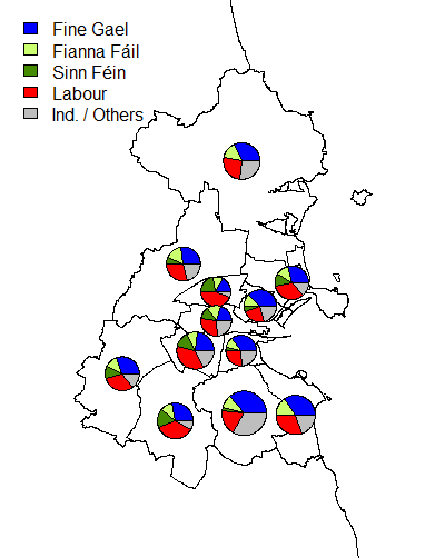
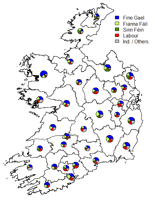
One of the unusual features of the Irish electoral system is that of transferable voting.  Since the constituencies (other than in by-elections or in Presidential elections) have more than one seat to be filled, the bigger parties often run more than one candidate.

They often try to spread the candidates out geographically throughout the constituency, in order to try to capture geographic transfers as well as party transfers.

Using an example,  from a 3-seat constituencies: Cork North West, I will explain how the transfer system works.  The calculation for the quota (the point at which a candidate is elected) is as follows:

\frac{NVotes}{NSeats+1}+1=\frac{NVotes}{4}+1

where NVotes is the number of valid votes, and NSeats is the number of seats being contested. Thus in the case of a three seat constituency, a candidate has to accumulate one vote more than 25% of the number of valid votes to be automatically elected [note that this doesn’t apply at the final count, as some votes are not transferred and so the effective number of votes is reduced].

CorkNorthWest

Count 1: All number 1 preferences are counted for each candidate.

At the end of Count 1, in the case of Cork North West, no candidate was elected, so they decided to eliminate candidates. In this case the three candidates (O’Donnell, Griffin and O’Sullivan) with the fewest 1st preferences were eliminated together.

Why aren’t they eliminated one at a time? Well, consider the case of the four lowest polling candidates:

  1. Green Party: C. Manning 1354
  2. Independent: J. O’Sullivan 478
  3. Independent: S. Griffin grey 439
  4. Communist Party: M. O’Donnell  185

The sum of 2-4 on this list is 1102.  So therefore, if they were to be eliminated one at a time, and all the transfers went to the next highest in the queue – so all O’Donnell’s 185 1st preference votes were transferred (by expressing number 2 preference) to Griffin (to result in a value of 624 votes for Griffin) and then O’Sullivan is eliminated (still having only 478 votes, having received no direct transfers from Griffin) and all O’Sullivan’s votes also go to Griffin, Griffin would still only have 1102 votes, which is less than Manning’s 1354.

Therefore, after Count 1, all of the ballot papers that had 1st preferences for O’Sullivan, Griffin or O’Donnell are then examined and the 2nd preferences are looked at. The votes are then literally transferred into the candidates’ that received the number 2 rank pile of ballot papers.

At the end of Count 2, still no one has reached the quota, so Manning (the remaining candidate with the fewest votes) is eliminated.  Any of Manning’s votes that attempt to make their next preference for one of the already eliminated candidates have their next available preference considered.  Note that, since a Supreme Court judgement, if a voter forgets to include a preference – so gives ranks 1-3, forgets 4, restarts at 5, then all preferences after 3 are deemed invalid and the vote becomes non-transferable.

This process continues until Count 8, when a candidate is elected (if more than one is elected on the same count, the one with the greater surplus is considered first; if the excess is so small as to not to make a difference to potential order of elimination/election, they may choose to go straight to the next elimination).  Counters look at the last pile of votes added into Creed’s pile of votes – the transfers from Collins, another candidate from the same political party.  They look at all the next preferences in this pile and then split the number of excess votes in proportion to the next available preference (after Creed).  In this case, the majority of these went to O’Shea.   The votes they choose to distributed the excess from are randomly sampled [so as they do not consider lower order preferences, this could, potentially effect who are elected] – but it did not matter in this case, as Count 9 was the last count.

In this count, A. Moynihan exceeded the quota and was deemed elected.

M. Moynihan was then elected without them checking A. Moynihan’s excess as M. Moynihan was sufficiently far in excess of the only other remaining candidate (O’Shea) that it would not have made a difference, even in the unlikely event that all of A. Moynihan’s votes went to O’Shea  (although of the same party, the two Moynihans are not related).  Thus M. Moynihan was elected without making the quota, because, by Count 9 there were 3,650 untransferred votes, making it impossible for the final person elected to exceed the quota.

Posted in politics, Uncategorized

On Voting: different systems

It’s Irish election time; causing me to think about the differences between the UK and Irish election systems for general elections.
UK’s First Past the Post system means that most voters are really voting for a party rather than a candidate. There are safe seats where candidates without any attachment to the constituency can be parachuted in and win. For all the attachment to constituency based politics, I’ve heard little from candidates despite living in a relatively unsafe seat.

Ireland’s Proportional Representation via Single Transferable Vote in multi -seat (3, 4 or 5 seats) constituencies means that there are no fundamentally safe seats. In constituencies that a party is popular in often more than one candidate from the same party is on the ballot paper. This lack of safe seats leads to a lot more clientism and localism in Irish TDs (MPs).

Ideally those elected should contribute to the good of the entire country, not just their constituency, but the Irish system doesn’t necessarily encourage that type of behaviour among voters.

 2011 1st Preferences % of 1st Preferences Number of Seats % of Seats
Fine Gael  801,628  36.1  76  45.8
Fianna Fáil  387,358  17.4  20  12.0
Sinn Féin  220,661 9.9 14 8.4
Labour  431,796 19.4 37 22.3
Others  378,916 17.1 19 11.4

Transferring of votes is very important when considering electoral success in Ireland.  Fine Gael (and to a lesser extent Labour) did well – gaining a greater percentage of the seats in the Dáil than would be expected on a purely proportional split of votes.  Indeed, they encouraged transfers of votes between the two parties (once their own list of candidates was exhausted).

Quotas in Irish General elections are as follows:

  • 3 seat constituencies:  (25% (1/4) of the valid votes)+1 vote
  • 4 seat constituencies: (20% (1/5th) of the valid votes)+1 vote
  • 5 seat constituencies: (1/6th of the valid votes)+1 vote

The final seat often does not make the quota due to people not having a full ranking of candidates (so the effective quota reduces).  This makes the last seat the seat most dependent on the success of a candidate at attracting votes from others.  This has been a traditional problem for Sinn Féin – them failing to attract transfers in the same numbers as other parties (this happened in the last Dublin South-West by-election)

Fianna Fáil did particularly poorly in Dublin in the 2011 election – returning just a single seat:

IrishElection07-seats-Dublin
Number of Seats per party in each Dublin Constituency

Comparing that to the relative share of 1st preference votes; we can easily see what a disaster Dublin was in 2011 for Fianna Fail.

IrishElections07-1stpref-Dublin
1st preference vote share: pie charts are proportional in size to the number of valid votes

In the rest of Ireland, this trend was echoed, but not to the same extent:

IrishElection07-seats-country
Number of seats returned in each non-Dublin constituency

Compared to vote share of 1st preferences:

IrishElections07-1stpref-country
1st preference share by constituency

It will be interesting to see how this changes with the results over the weekend.  The fragmentation of votes has been predicted by polls and media, but whether this will continue down to the vital second, third and fourth preferences will only reveal itself over the weekend.

Posted in Uncategorized

Video based learning materials

From recent discussions with students it has become obvious that where previously the first port of call for students trying to understand a method would have been their notes, followed by recommended textbooks, students are turning away from the written word [in statistics / mathematics at least].

Which leads me to think about what type of material is best conveyed through the medium of video rather than as static text.

For a number of years, I have been recording derivations done (generally aimed at final year mathematics undergraduate students).  I try to keep these to under 10 minutes in length, but when I review average watch duration, it is under 3 minutes.  Having thought about this carefully, I can’t see a way to shorten these videos without loosing important details.

These videos, considering how niche the target audience is, have proven to be surprisingly popular.  Looking at when during the year the peak viewing figures are, they nicely correspond to when most students would be first introduced to the material and then again when they would be revising for examinations.  An example of one such video is below:

I’ve also begun to start recording screen demonstrations of how to do different statistical analyses in Minitab and SPSS.  This includes not only the basic “how to” but also how to then appropriately edit the resulting output for professional looking reports.  These are pitched at second year mathematics students and also at students on MSc programmes in Biology style subjects doing Research Methods courses.  For clarity, I keep these on a seperate youtube channel; an example which is feedback for a piece of 2nd year coursework is below:


But this leads to a problem: how do I do the same for R?  Beyond the very basics of the initial set up, R is very much a command line, and hence text based language.  Despite much trial and error, I’m still struggling to make good videos without spending a huge amount of time on each.  The problem is that I’m essentially just commenting on code.  It is rather unnatural for me to do this of any other way than by text as it would be much faster to read the text based comments than to listen to the same comments being made on a video.

I prefer to create my R scripts during my videos.  I don’t like to “pre-script” the videos as my voice becomes flat rather than conveying enthusiasm.  My current major issue with this is that the audio track of the videos are full of sounds of me hitting the keyboard.  So I will give it one final attempt with a different keyboard, but otherwise I am stumped at how to deliver effective instructional videos for R.  The other alternative is to use pre-written R scripts, but I’ve found this to be a less dynamic solution.


Posted in Uncategorized

Great British Bake Off

After much discussion in class, the Great British Bake Off has come to a conclusion.  In less than 4 minutes after the announcement, twitter managed to have over 5,000 tweets with #GBBO.

This gave me another opportunity to use wordclouds to visualise the resultant tweets.  A basic wordcloud – using words with a frequency of at least 15 is the first step (obviously removing GBBO, because they all contain that!)

Tweets between 21:00 and 21:04 (BST) with #GBBO in the text

The next step was to try to look at sentiment analysis….

#GBBO tweets: coloured by the most frequent sentiment underlying the entire tweet.

A wonderful part of the twitter feed in the immediate aftermath was the overwhelming sense of joy – as captured by this very quick snapshot!

Why is Nadiya now noticeably bigger than final?  The second plot only uses tweets where the sentiment behind them can be determined.  So all those very short tweets that really didn’t contain much information within the text of the tweets were excluded from the final image.  The “names” of the sentiments are somewhat coarse: anger / fear may be also considered as frustration in some instances.

I’m sure that I could do a better job… but this was one piece of analysis where time is of the essence! If the bakers are under a three hour deadline, then so should I be.

Posted in Uncategorized

Rates and Replication Issues

More travelling for me… and during those travels, two stories struck me as worthy of comment. These were widely reported, but I’m using links from the Guardian for both stories.

Rates:

The revelation that “Thousands have died after being found fit for work”

http://www.theguardian.com/society/2015/aug/27/thousands-died-after-fit-for-work-assessment-dwp-figures

However, these figures do not give any baseline mortality rates.   This leads to the question of what the baseline should be.  What exactly should we compare these values to?  Some preliminary ideas include:

  1. Compare to the mortality rates of a typical fortnight of those on Employment and Support Allowance (ESA)
  2. Compare to the mortality rates of those on jobseekers’ allowance [probably not a good baseline measure]
  3. Compare to the general population – ignoring disability and employment status, but trying to account for other demographic factors.

The first option would be of immediate relevance.  If the mortality rate of those on ESA is lower than those who have been removed from ESA as they have been declared “fit-for-work” then there is an immediate and obvious major problem.

The second option isn’t really a runner.  Why? Well, although people have been ruled “fit-for-work”, this assessment does not state that they are fit and fully healthy.

The third option is a population baseline – an okay measure but obviously needing terms and conditions!

Not being able to compare these figures to anything meaningful makes them essentially meaningless. We can’t even really assess if they are unexpectedly high or low!  Insufficient detail on the causes of death [related to their disability, to the assessment process, accident etc.?] is another issue that would need to be examined before this story could be properly be deemed a fully fleshed out story.

Replication:

The story of the attempt to replicate results from 100 major psychology studies (where just over 1/3 of studies could be replicated) is welcome in that it stirs debate about the direction of science.

http://www.theguardian.com/science/2015/aug/27/study-delivers-bleak-verdict-on-validity-of-psychology-experiment-results

We would like, as a community, to be able to claim that science progresses in leaps and bounds. It is more typically a long hard slog; making tiny incremental progress.  The “publish or perish” culture is not healthy for long term scientific thinking.  Unless a replication study sets out to confirm the results of many other studies [such as the one quoted in this story http://www.sciencemag.org/content/349/6251/aac4716 ] then checking other peoples results carefully can be seen as a waste of resources; both time and money.  Editors deem it not be “innovative” and discount it off-hand; unless it is contradicting the findings of a major study, and thus has some controversy attached.

However, it is only by checking the results that we can hope to strengthen the foundations of future research.  Who should provide funding for the “boring” (not innovative) process of replicating others results before the community can assume the results to hold?  Furthermore, what is the point of doing these replication studies without others knowing that the study has been undertaken and the findings found to either support or undermine the original results?  There is definitely a gap for a good open access repository for the results of replication studies.  Without spending a large amount of time on the write up – a simple experimental design, noting any adaptations / amendments to the original study, with the reasons for those designs, and the results and a headline of whether the original study was confirmed or undermined would provide a useful tool for researchers.  If this could then be extended so that online versions of the original study would then have to link to the relevant replication studies within the repository I would be ecstatic.

With publication bias still a major issue; effect sizes and statistical significance of results in the published literature should be taken with a pinch of salt.   But we shouldn’t have to replicate each study before relying on the findings.  But who is going to properly lead the charge to ensure that replication studies are undertaken and then that the subsequent findings are accessible in order to avoid wasted effort?

Posted in Uncategorized

A Statistician on Holiday

I had the privilege of going on holidays to the European Juggling Convention in the beautiful setting of Bruneck / Brunico [yes, a town with two names] in Northern Italy.  This was my 11th EJC in a row [starting with Ptuj, Slovenia in 2005].

Earlier this year, I had set my students a piece of coursework modelling the arrival patterns of people attending this festival.  While their predictions about overall numbers were accurate pretty much everything else was wrong. I had somewhat simplified the problem that I gave them to investigate.

What factors should have been included in the modelling process?

Cost of ticket – especially the difference between the pre-registration price and the cost of paying on the door.  In recent years the difference between these prices has been deliberately increased by organising teams and it is very difficult to plan for those who arrive without registering in advance.  How does a team know how many shows, showers, camping space and toilets are needed for everyone to enjoy the week in comfort unless they have the numbers in advance?

With a greater proportion of people pre-registering, more arrive during the first weekend to get full value out of their ticket and fewer arrive during the night as the convention progresses, meaning that the registration desks can be completely closed down for a good six hours every night for the majority of the week. This was another feature that some, but not all, students picked up on as being a trend.

Ease of registration system – this year Andi did a wonderful job in creating a new system that made onsite processing extremely quickly.  This meant that historical information on how long it took to process each arrival was really inaccurate and predictions about the number of desks needed and whether there was a persistent queue were really inaccurate.  However, the prediction that nine desks would be an appropriate number for the first few hours was correct!  The persistent queue had vanished by 14:30 on the first Saturday because of Andi’s system.  My first real observed practical use for QR codes.  We ended up being able to fully process a person in an average of about 90 seconds.

(the system in action!)

The data that I gave students was fictional, but plausible data, simulated to give everyone different data to work with having the same underlying structure for consistency.  It gave them a chance to examine a real problem, with relevance that they could see for event planning.  Incomplete information is an issue that we constantly arrive with in real life, so it is interesting to see the direct consequences of missing information in action, especially when examining the evolution of behaviour over a number of years.

Posted in Uncategorized

May you live in interesting times

It’s been a very busy month for Greece.  Not in a particularly good way.

Inspired by Oliver Marsh’s talk (@SidewaysScience) at the Science in Public 2015 Conference, I pulled data from twitter feeds relating to Greece.  After much trial and error, and discovering that you can only easily access data from about the last 9 days via the API (which I accessed directly through R).

To visualise this complex data, I have used wordclouds, coloured by emotions as classified by the sentiment package in R.

I picked four days:

  1. Tuesday June 30th: on this day, Greece missed an payment to the IMF.  Banks had been closed on June 29th, after the referendum was announced and approved by the Greek parliament over the previous weekend. Capital controls are in place, with withdrawal limits of €60 in place.
  2. Monday July 6th: the immediate aftermath of the referendum that returned a decisive “OXI” (no) vote
  3. Monday July 13th: a deal is struck in Europe; the conditions harsher than those rejected in the referendum vote.
  4. Thursday July 16th: The Greek Parliament begins to approve measures as required by creditors; some violent protests in Greece that evening.

Tuesday June 30th:

June 30 twitter

Surprisingly, Angela Merkel and François Hollande actually featured more prominently than any Greek politicians on twitter on June 30th!  This may be because their names are easier to spell, thus making spellings more consistent.  This is one problem with standard text analysis: spelling mistakes are not accounted for unless a lot of prior data cleaning is undertaken.

Monday 6th July

Twitter July 6

The immediate reaction on twitter to the referendum results are a combination of surprise, disgust and fear.  In the tweets in English, at the very least, did not contain much joy / jubliation after the No vote.  Even at the time, it seems as those on twitter were very aware that a no vote wasn’t really going to help the Greek cause.

Monday 13th July

Twitter July 13

This day marked the realisation of the capitulation of the Greek government to the demands of the creditors.  The third week of capital control in Greece continued.

Thursday 16th July

Twitter July 16

The disgust both relating to the violent protests and towards the imposition, against the public vote, of the harsh conditions attached to the bailout, are evident in the twitter stream [over 90,000 tweets] on July 16th.  The names of Greek politicians are more prominent here than on June 30th.

Posted in Uncategorized

Thoughts on Being a Judge

Well, the results have been announced so I am now somewhat at liberty to discuss my thoughts on the submissions to the RSS Excellence in Statistical Journalism awards [http://www.statslife.org.uk/news/2324-rss-journalism-awards-2015-winners-announced].  There were some very worthy winners!

The Good:

Some of the submissions were excellent; well-pitched to their target audience, of appropriate length and detail and could become really good teaching examples. A slight down-side to this was the difficulty in placing submissions in the most appropriate categories: one of the lessons learned from the judging point of view is to be stricter on having those submitting the pieces to select one and only one category. One piece that I really enjoyed, but that didn’t earn a prize, was from More or Less. It faced tough competition in its category, and was slightly hampered by not exactly “fitting” the categories.  Also, examples of really good practice was the provision of supporting material: background to how the data was sourced and the terms and conditions applied to the data.

The Bad:

Pieces that were much too long. Although the rules stated that longer pieces could be submitted by agreement, submitting something more than ten times the standard limit that could not be reasonably be expected to engage a typical reader. Why were these bad? In general they tried to tell too many stories rather than just a concentrating on telling the story of a single issue well.

The Ugly:

Graphs! Seriously there were some really bad graphs. Doughnut plots were especially poor – even worse than pie charts. The poor use of graphs was particularly disappointing given that many of the submissions were working with graphics departments. In other graphs, the kitchen sink was thrown into the process. They could do well with reading Tufte’s “Principles of Graphical Excellence”. While I wouldn’t recommend them to follow the recommendations to the letter, understanding that simplicity and clarity of graphs is important.

And Finally:

The judging process itself was quite efficient; with judges ranking submissions in individual categories. Then, before the main judging day, those who were involved in the final judging process were then sent all the pieces that had been shortlisted. This allowed for very quick decisions to be made in some categories, and time for interesting discussions on the pieces in other cases.

Posted in Uncategorized

Athena SWAN ceremony

Today was spent at the Athena SWAN awards ceremony for institutions and university departments in the University of Greenwich. I’ve been on the departmental Self-Assessment Team since the beginning, so was one of those selected to represent our department.

The general consensus is that the process needs to be made more consistent; especially if people are to be recruited and retained on the judging panels. One idea that found favour amongst those that I talked to was a standardisation of the data presentation.

Essentially, each applicant team would enter the data into a pre-designed spreadsheet, by selecting the appropriate groupings of academics to be compared to for the benchmarking process. Every application team is having to track down benchmarking data – surely it must be a more efficient process to have this centralised and provided to applicants: otherwise, for completeness of reviewing, the benchmarking data used for each application must also be verified.

If the benchmarking data was provided, with space for the applicant teams to insert their data, this could be used to generate graphs and tables that are consistent, allowing the reviewing panels to compare different submissions at a glance.

Teams could then concentrate their focus on creating useful action plans, of monitoring progress and of creating much tighter and shorter applications that refers to the tables / figures generated automatically. This would, in turn, encourage more people to put themselves forward as panel members. I know, that, as it stands, I could think of very few things that I would less like to spend my time doing than wading through a pile of submissions.

In the midst of all the self-congratulating, there was some discussion of the Tim Hunt affair. To me, thus far, there has been a lack of engagement with the issues raised by his “joke” by those running Athena SWAN. The question of whether women require more emotional support and encouragement in research settings – especially in those labs where they are in the minority – is being looked at by many involved in the Athena SWAN process. Issues of confidence rather than competence is a major problem that needs to be addressed when we are trying to widen participation in STEMM [Science, Technology, Engineering, Mathematics and Medicine] subjects. If Hunt had focused his remarks on this – and questioning why this is the case – he would have been applauded.

The response [especially the twitter hashtag #distractinglysexy] has been pretty good humoured. Despite some people saying that there has been a witch-hunt, my impression is that the majority of those responding to the furore have been playing the ball rather than the man.

The reaction has also allowed us to note that comments such as Hunt’s support the reasons for Athena SWAN existing: these dinosaur-like opinions are still out there, especially amongst the older, more senior often quite influential, academics. It gives us a prime chance to motivate proposed changes and to show how they can be advantageous to (almost) everyone.

Posted in politics

Good democracy requires some theatre!

The frenzy to report results overnight after UK general election is unsightly. The rush to be first to declare is especially ridiculous – do we not deserve some care to be taken over the counting of our votes rather than people dashing around with boxes? In the rush to return results some of the potential theatre is lost. Those thinking about reinvigorating the UK system without making dramatic legislative changes should relax, the country won’t collapse if it needs to wait an additional 12 hours for a result, especially after a long campaign, but it may engage a wider audience with the electoral process.

A big difference was noticeable when the Irish referenda were counted over the weekend. By counting the results during the daytime, there was an increased sense of openness about the counting process. Just as justice should be seen to be done, so should the democratic process. Counting the results during the daytime means that the results were announced when the nation was awake and waiting for the results rather than having being finalised overnight, when only political anoraks are awake. The electorate did not wake up to the results; rather they observed first the initial estimates from the initial tallying of votes, then the actual results coming in.

The reporting of these tallies is an important part of the theatre surrounding Irish electoral system. It helps to build the tension throughout the day. Furthermore, they enable a comprehensive understanding of the geographic distribution of the notes not available within the rushed UK system.

Tallying, in Ireland, is done by volunteers of various political persuasions who observe the unfolding of votes from the other side of the fence. Each box is identified and the votes are recorded. The parties co-operate to ensure as wide a coverage of the different boxes as possible.

The process of tallying votes means that we get to hear about the surprises such as the box in Finglas West that was reported to be 100% Yes for the Marriage Referendum. From a political point of view, having this insight into voting at a very local level, there is confidence in the statement that the votes were not split along an urban / rural divide.   The results were more complex; cities and large towns voting yes, with strong yes votes also in some very small villages, but no votes in small towns.

Democracy is a form of theatre, let it be lit by the light of day!