A quick peak at how marginal the different seats were in the 2010 election.

To interpret this map: the darker the colour, the greater the majority. I’ve looked at the 3 major (2010 general election) parties in this map. Still working on a better colour scheme for screens; if current polls are correct, I’ll need another colour for the Scottish National Party, and at the moment it is difficult to distinguish between some of the reds [Labour] and oranges [Liberal Democrats].
Considering that Labour won 258 seats in 2010, some may find the relative lack of red on the map surprising. This illustrates one of the problems of mapping constituencies that are really different sizes due to population density disparities. Therefore, looking at the NUTS1 regions allows more detailed map to be used.
London, Scotland and the SouthWest are used as illustrating examples of looking at things at NUTS1 level.

London demonstrates some obvious spatial patterns – inner and outer London didn’t vote in the same way in 2010 – will this change this year? If so, will demographic changes have influenced any changes? Or would socio-economic factors be a bigger driver of change in voting behaviour?

So, a major difference between London and the South West is the lack of Labour seats… but also the lack of dark shades – there are many more “closer” seats in the South West than in London – the colours on this map will definitely change on Friday! Also, the odd shaped constituency near the top of the map is Bristol North West – some of the boundary is in the Bristol Channel – due to the strange shape of Avonmouth!
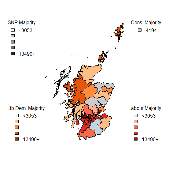
The Tories only won a single seat in Scotland… so really there was no need to show an actual scale for them. The SNP are expected to dramatically change this map too!
So, work to do before Friday: better colour scheme – I’ll have to go away from colours that are related to the traditional colours.
Also, I need to sort out the socio-demographics (based on Census data) for the constituencies and ecomonic factors – which will be limited by the data that is available on a constituency level [for example JSA claimant count records the number of people claiming Jobseekers Allowance (JSA) and National Insurance credits, which is not an official measure of unemployment, but is the only indicative statistic
available for areas smaller than Local Authorities.]
I’m not sure how much use the readily available data will be when it comes to explaining the regional variations (especially the differences between 2010), but it will be a busy weekend of analysis.
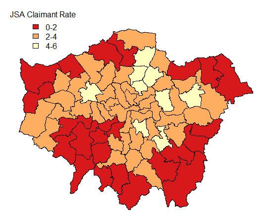
A note: the constituency with the highest JSA [and those claiming National Insurance credits] claimant rate is Birmingham Ladywood – with an estimated rate of 14.6% of economically active residents. The next highest is also in Birmingham (Hodge Hill) with the JSA* rate estimated at 9.7%
